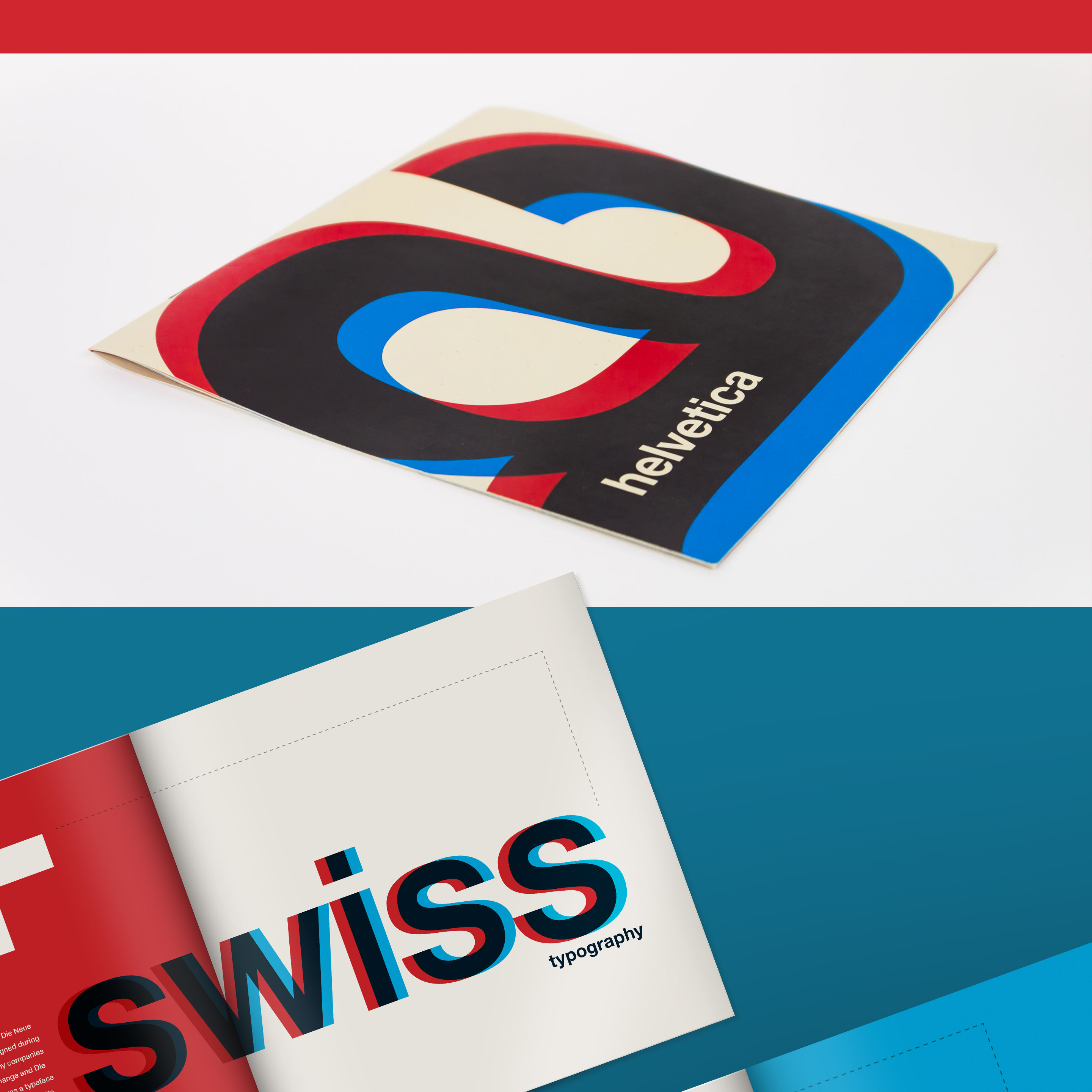


The goal of this project was to create a brochure that both exemplifies the iconic design attributes and honors the heritage of an influential typeface. With that goal in mind, I developed Helvetica, a multi-spread print brochure, incorporating classic typographic elements alongside a variety of dynamic compositions.
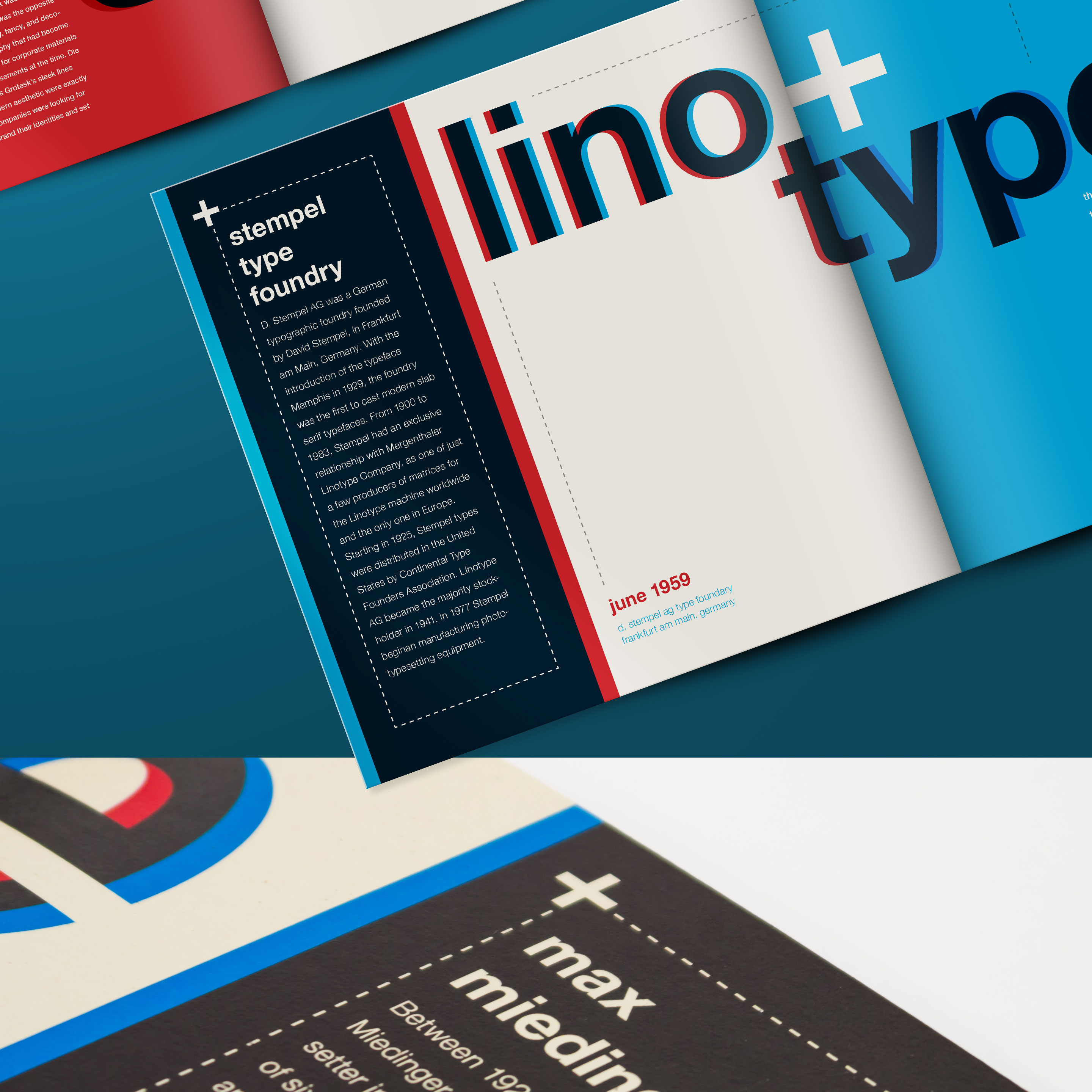
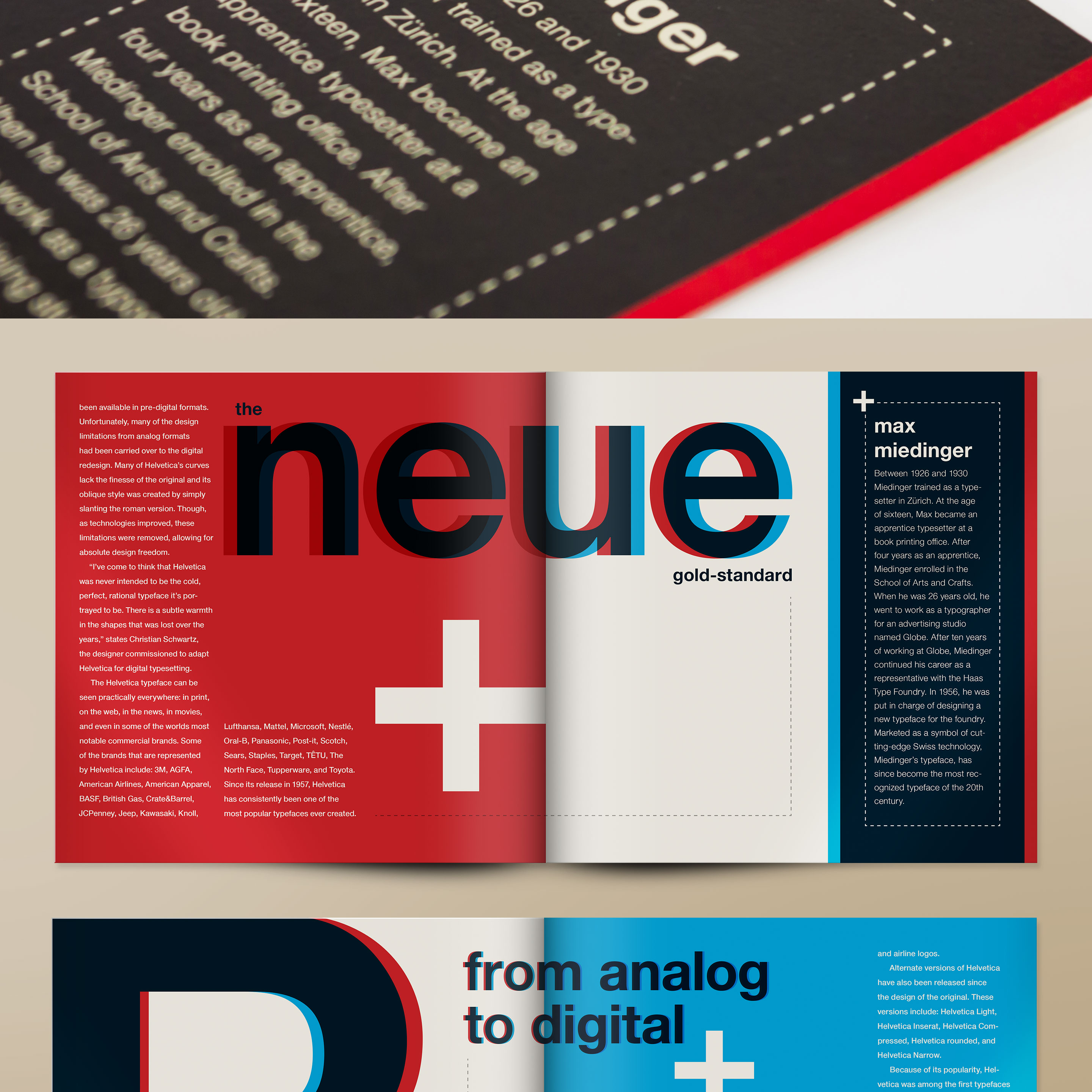
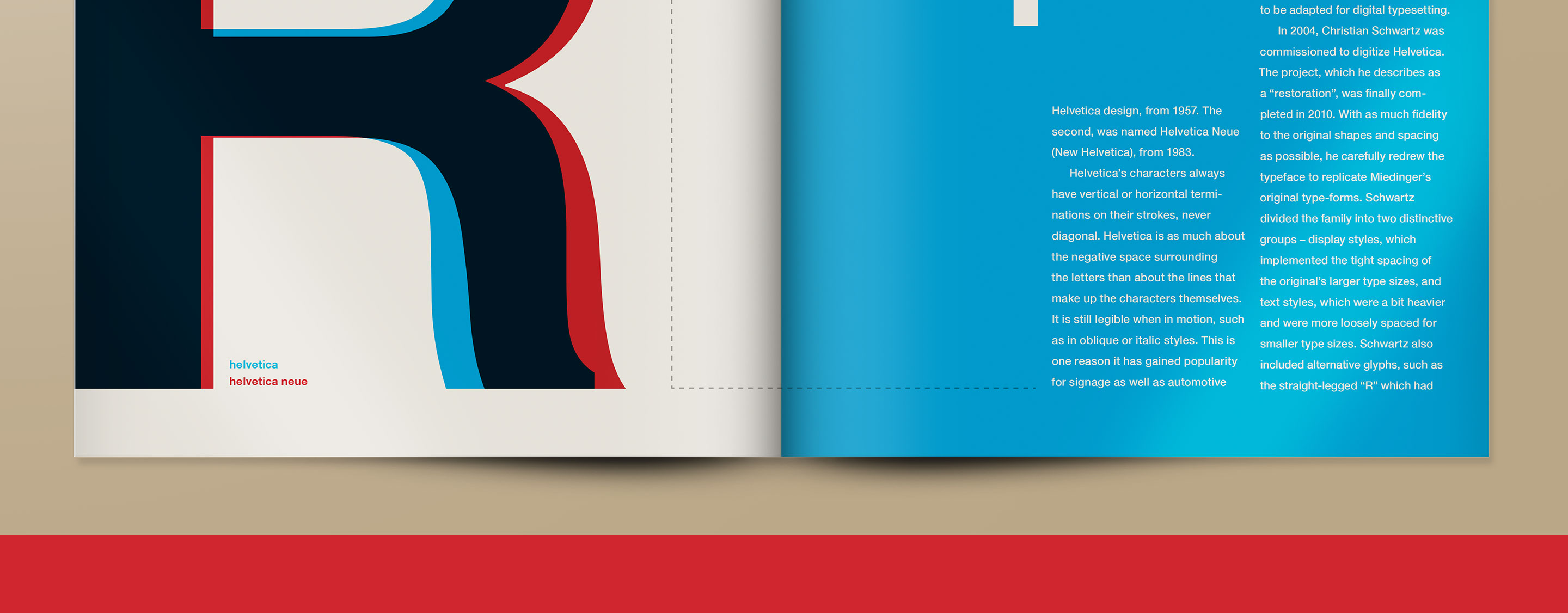
The solution was to make use of a strict grid structure and a Swiss color palette to communicate the international-style design. Large character overlays were used to emphasize the various letterform iterations that were made over time. The choice was made to print the brochure on a Speckletone French Paper®, including dashed lines throughout as a way to reference the original typeface blueprints as well as reinforce the visual grid-system used by designers during that period in history.